In today’s digital age, mobile shopping has become an essential part of the eCommerce experience. In fact, according to a 2023 report from Statista, over 72% of global eCommerce sales are expected to come from mobile devices. This means that if your Shopify store isn’t optimized for mobile users, you’re potentially losing out on a significant amount of sales.
Fortunately, optimizing your Shopify store for mobile is not as complex as it may seem. In this article, we’ll explore practical steps you can take to ensure that your Shopify store delivers a seamless experience for mobile shoppers, helping you convert more visitors into customers.
1. Choose a Mobile-Responsive Theme
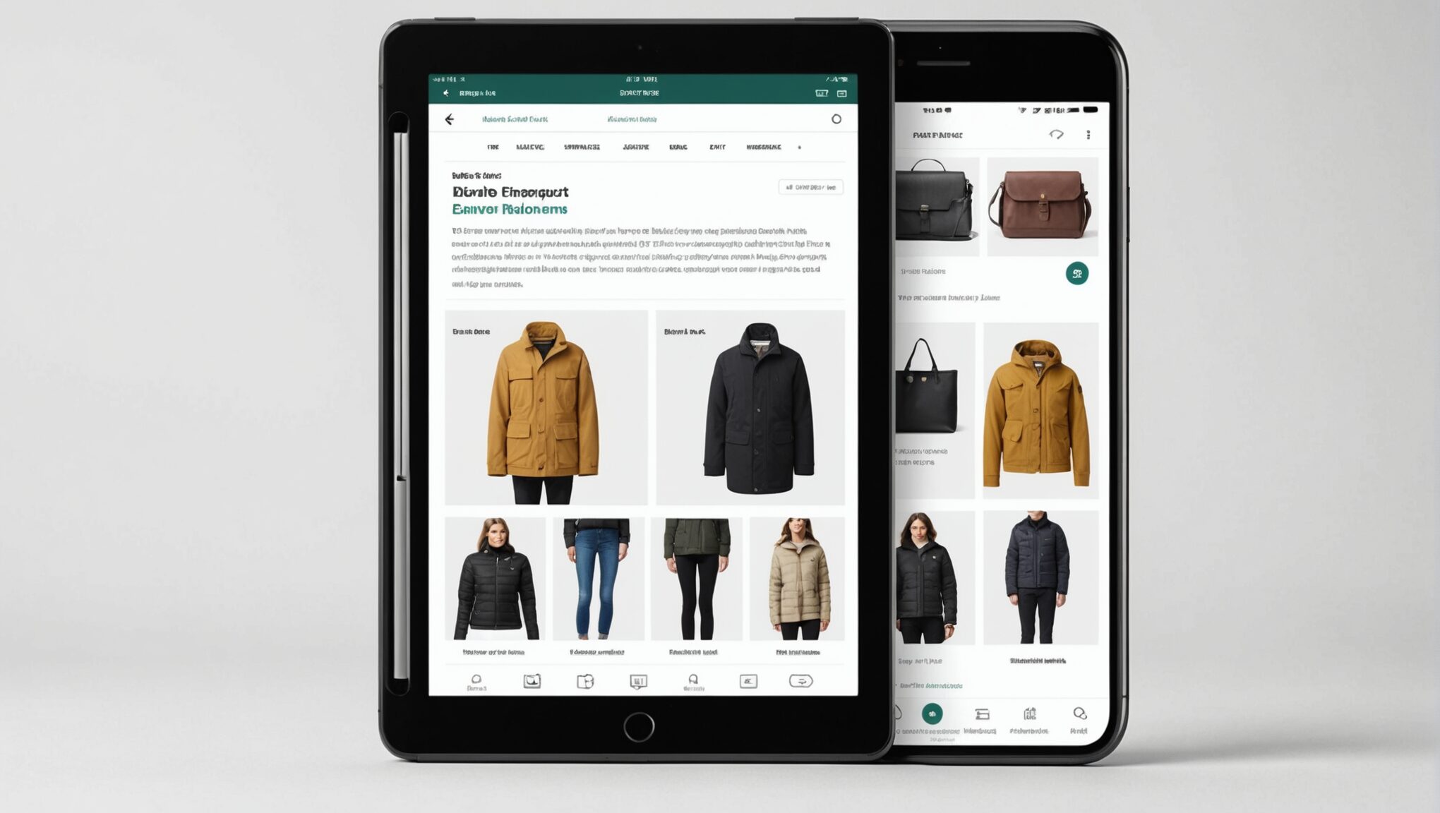
One of the most crucial aspects of optimizing your Shopify store for mobile is selecting a mobile-responsive theme. A responsive theme automatically adjusts its layout based on the device’s screen size, ensuring that your store looks great on smartphones, tablets, and desktops.
Key Features of a Mobile-Responsive Theme:
- Flexible Layout: Your content should automatically adjust to different screen sizes, ensuring it looks good on any device.
- Optimized Images: A mobile-friendly theme resizes images and compresses them to load faster on smartphones.
- Touch-Friendly Navigation: Buttons and menus should be easy to tap without zooming in.
- Fast Loading Time: Mobile users expect fast load times, and responsive themes are designed to load quickly across devices.
You can find a variety of free and paid responsive themes in the Shopify Theme Store. When choosing a theme, ensure it aligns with your brand’s aesthetic and provides a seamless shopping experience for your customers.
2. Optimize Your Store’s Mobile Navigation
Mobile screens have limited space, so it’s essential to make your store’s navigation as intuitive as possible. Here’s how you can enhance the mobile navigation experience:
Simplify Your Menu
Avoid overwhelming your visitors with too many categories. Instead, focus on creating a clean, simple, and easy-to-navigate menu. A good rule of thumb is to keep your main categories visible while using drop-down or expandable menus for subcategories.
Implement a Search Bar
Mobile shoppers often want to find products quickly, so adding a prominent search bar at the top of your mobile site is crucial. Shopify makes it easy to add search functionality to your theme, allowing users to search for products with just a few taps.
Sticky Navigation
A sticky navigation bar ensures that key elements like your menu, cart, and search bar stay at the top of the screen as users scroll down. This makes it easier for customers to navigate your store, especially when they’re browsing product pages.
3. Streamline the Mobile Checkout Process
A complicated or lengthy checkout process can be a major barrier to conversions, especially on mobile. To increase sales, you must optimize the checkout experience for mobile shoppers.
Simplify Forms
Long forms can be frustrating to fill out on small mobile screens. Reduce the number of fields required to complete a purchase, and offer autofill options where possible to save customers time. Shopify allows you to customize the checkout flow to minimize friction.
Enable Guest Checkout
Forcing customers to create an account before making a purchase can lead to abandoned carts. Offering a guest checkout option allows shoppers to complete their purchase without the need for creating an account, which can significantly increase conversions.
Mobile-Friendly Payment Options
Make sure your payment gateways are optimized for mobile. Shopify supports a variety of mobile-friendly payment options such as Shopify Payments, PayPal, Apple Pay, and Google Pay, which streamline the payment process on mobile devices.
4. Optimize Images and Media for Faster Loading
Mobile users are often on the go, and they expect websites to load quickly. Large, high-resolution images can slow down your store, leading to a poor user experience and higher bounce rates.
Compress Images
Before uploading images to your Shopify store, compress them to reduce file size without sacrificing quality. Shopify offers apps like Crush Pics or Image Optimizer that can automatically compress images for faster loading times.
Use the Right File Format
Different image file formats can have varying impacts on loading speeds. For most product images, JPEG files are ideal because they offer good compression while maintaining quality. Use WebP format for even better compression if possible.
Add Lazy Loading for Images
With lazy loading, images only load when they’re about to appear on the screen, rather than loading all images at once when the page loads. This can significantly improve loading times, especially for product-heavy pages.
5. Test and Optimize Mobile Performance Regularly
Optimizing for mobile is not a one-time task. As new devices and updates are released, it’s important to regularly test your store’s performance on different mobile platforms. Shopify offers built-in tools to test your store’s mobile-friendliness, but you should also manually check how your site performs on various devices.
Use Shopify’s Mobile-Friendly Test
Shopify’s built-in Mobile-Friendly Test allows you to check if your store’s theme is responsive and easy to navigate on mobile devices. This tool helps identify issues that may be hindering the mobile experience.
Test Checkout on Mobile
To ensure a smooth checkout process, regularly test your checkout flow on mobile devices. Ensure that customers can easily add products to their cart, navigate through checkout, and complete the transaction without issues.
Use Google’s PageSpeed Insights
Google’s PageSpeed Insights is another valuable tool for testing your mobile store’s performance. It provides insights into how quickly your store loads on mobile devices and offers suggestions for improving speed and performance.
6. Leverage Mobile-Only Features to Enhance the User Experience
Smartphones offer unique features that desktop users don’t have, and Shopify can help you take advantage of these features to improve the shopping experience.
Push Notifications
Mobile users are more likely to engage with push notifications, which can be a powerful tool for driving traffic and sales. Shopify apps like PushOwl allow you to send personalized push notifications to mobile users to remind them about abandoned carts, new products, or special promotions.
Mobile-Optimized Pop-ups
Pop-ups can be annoying on desktop, but they can be effective on mobile when used correctly. Consider using mobile-optimized pop-ups for promotions, discounts, or to encourage sign-ups for your newsletter.
Conclusion
Optimizing your Shopify store for mobile shoppers is no longer optional—it’s a necessity. With more people shopping from their smartphones, offering a seamless, mobile-friendly experience is crucial to increasing conversions and staying competitive in the digital marketplace.
By selecting a responsive theme, simplifying navigation, optimizing checkout, compressing images, and leveraging mobile-specific features, you can ensure your Shopify store is prepared to meet the needs of today’s on-the-go shoppers.
Remember, the mobile experience should be just as smooth and user-friendly as the desktop version, if not better! Regularly test and optimize your store, and you’ll see a significant improvement in mobile traffic and sales.
Ready to optimize your Shopify store for mobile? Start by reviewing your current mobile experience and making the adjustments outlined above. Small improvements can lead to big results when it comes to mobile eCommerce!